The Joy of Painting Data
Elsie Lee-Robbins2023
Featured in Nightingale as a Data is Plural submission.
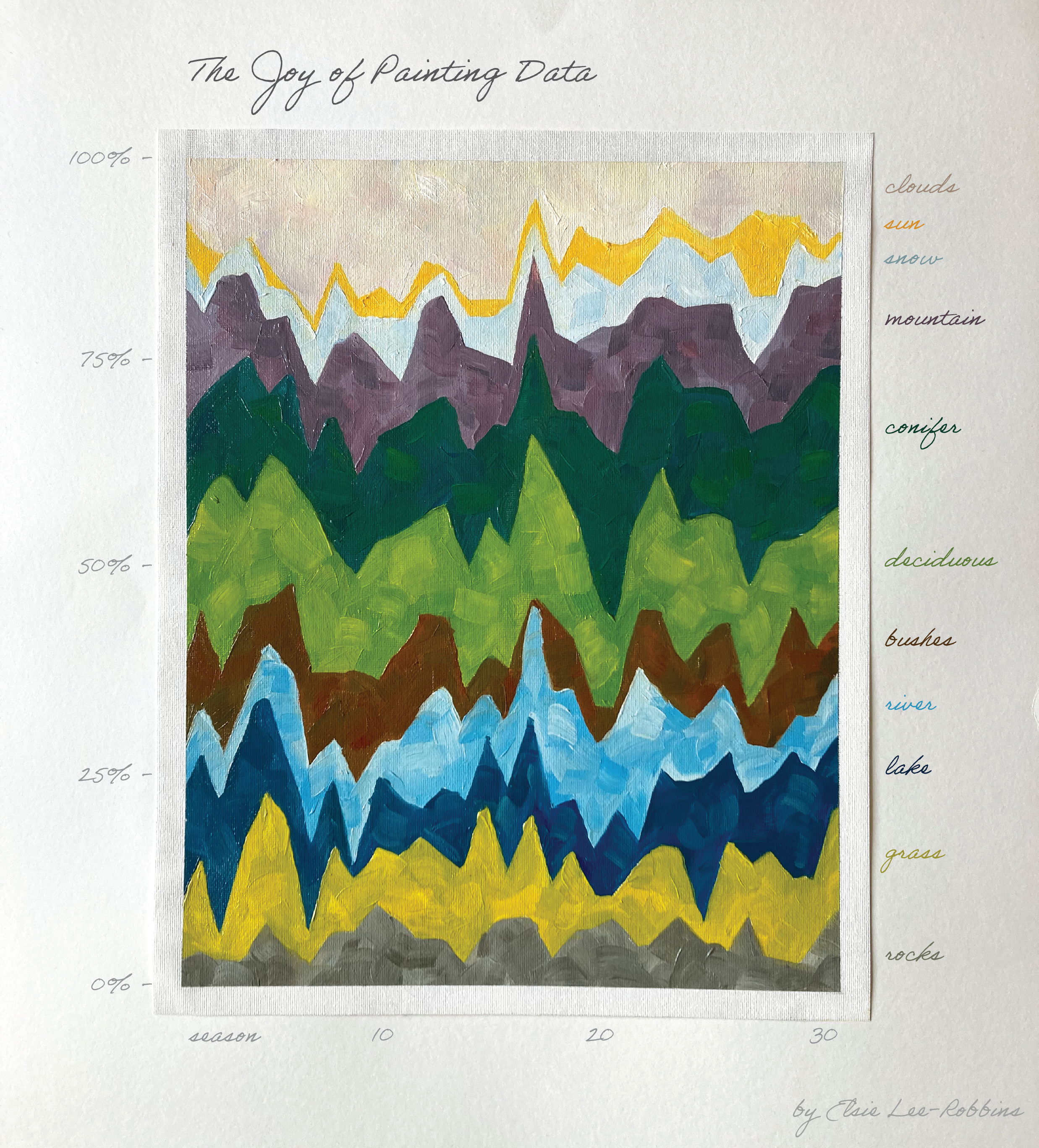
This is a stacked area chart of elements that appear in Bob Ross paintings each season: clouds, sun, snow, mountain, conifer trees, deciduous trees, bushes, river, lake, grass, and rocks. Percentages add up to 100 on the y-axis, with seasons from 1-31 on the x-axis. The data is painted on canvas with oil paints with slight variations in color within sections and visible brushstrokes. Inspirations were Michael Correll’s Ross-Chernoff Glyphs, Gabrielle Merite, Jill Pelto, and Alai Ganuza.
I made a video of my process! I started with playing around with different designs in Excel and eventually decided on a stacked bar chart. Then, I printed out a version with just a line in the size of my canvas. I covered the back of the paper with graphite (pencil) and then traced over the front as to transfer the lines to the canvas. Now onto the fun part! I painted each section of the stacked area chart in oil paint. Yes, this is an actual physical painting! Finally, I did some post-processing in Adobe Illustrator to add in the x and y axes and the labels for the sections.
@starkidelsie 🎨 Bob Ross Data Visualization 📊 #DataViz #BobRoss ♬ Marianela (Que Pasa) - Hugel & Merk & Kremont & Lirico En La Casa