LEGO Themes: From Generic to Franchise
Elsie Lee-RobbinsJanuary 21, 2024
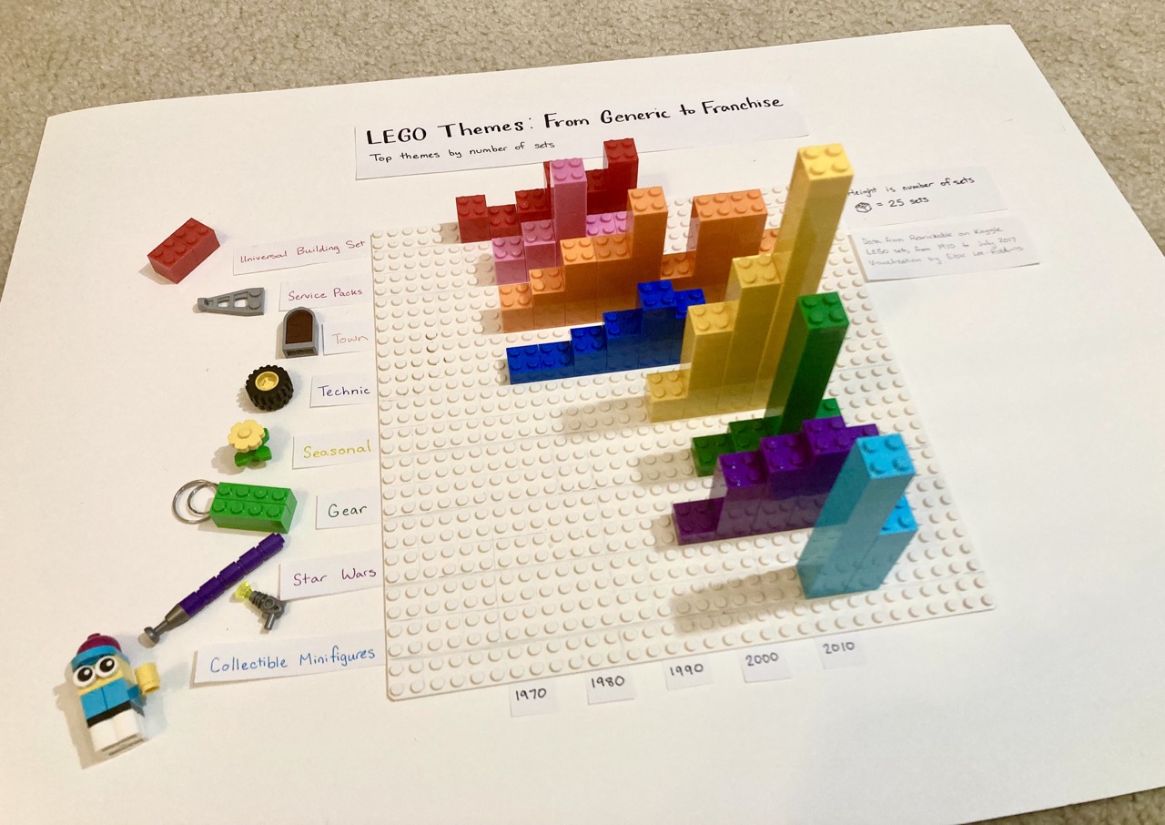
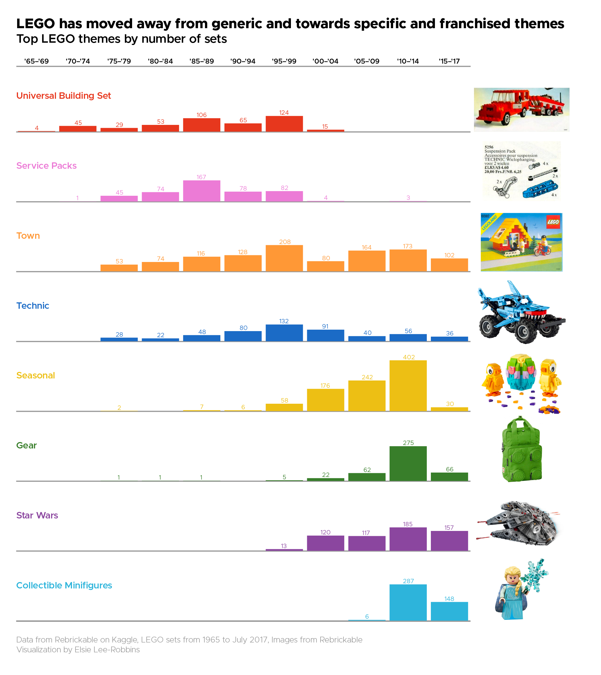
These are the top LEGO themes by the number of sets developed for each theme over time. This data visualization shows that LEGO has moved away from generic themes such as "Universal Building Sets" and "Town" and towards specific and franchised themes, like "Star Wars" and collectible minifigures of popular characters like Harry Potter.
How I Made It
This data visualization was made as part of the Big Ten Data Viz Championship for Love Data Week. [EDIT: I won!] We were challenged to use the Rebrickable LEGO Brick Dataset on Kaggle. This dataset is made up of eight csv files that are all connected to each other, so to keep things simple I just decided to use two of them: sets and themes. First up, themes. There are 614 themes, but I noticed that most of them are sub-themes that fit under a larger parent theme. For each theme, I identified which major theme it fit under, which left me with 111 themes, which is more manageable, but still a lot. Using pandas, I joined the sets dataframe and the themes dataframe. Then I calculated the number of sets for each theme for each year. An initial data visualization was to see the number of sets for each theme.
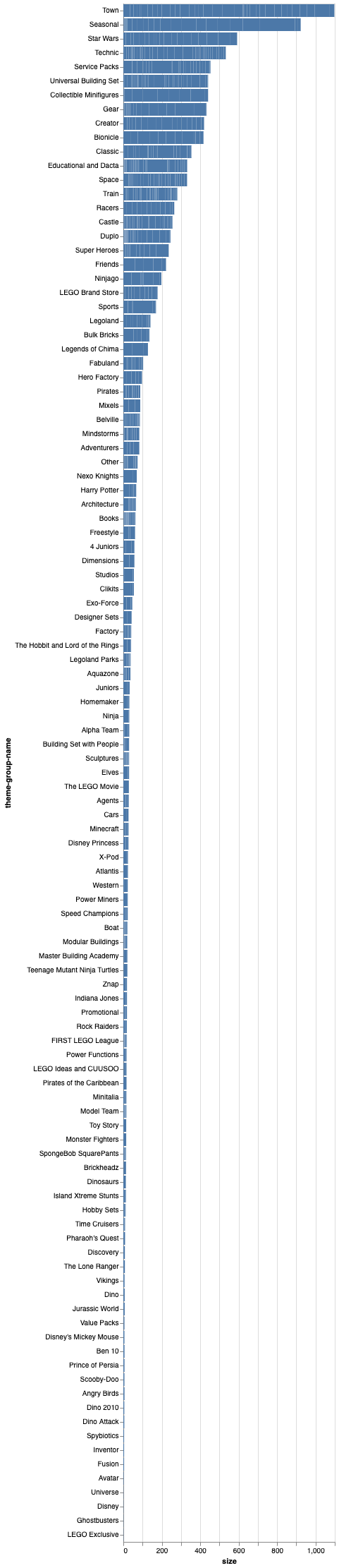
As you can see, there are a ton of themes that don't have a lot of sets. I decided to focus on the top themes, and filtered out the top eight. Then I calculated the mean year for the sets, and ordered them from oldest average year to newest. After some aggregating and binning, I'm at a pretty good place!
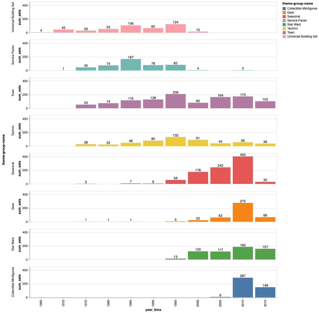
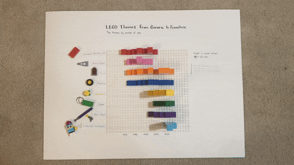
My ultimate vision was to create a data visualization out of LEGOs, so I needed to do some calculations for the mapping of LEGO to number of sets. The top theme, Town, had a total of 1098 sets. So, I started with an estimate of 20 sets would equal 1 LEGO brick, but I ran out of bricks and had to up it to 25 sets per LEGO. I also rounded each value in the bar chart to the nearest 25-interval. This meant that I lost some of the smallest values below 12.5 sets, but overall I think it was worth it. I organized my LEGO colors, put together my chart, and added some labels for the axes.
I also cleaned up the digital data visualization version, in case people were interested in the specific values. I brought the SVG into Adobe Illustrator, cleaned up the grid lines and matched the colors, and for good measure I added a picture from Rebrickable of an example of a LEGO set for each theme. Oh no! This is where I realized that the theme "gear" is not what I imagined as some kind of engineering gears and pulleys and levers theme, but was, in fact, backpacks and key chains and games.
I love how this turned out. I always have so much fun creating data visualizations with LEGO and this was a great dataset to put them to the test! Check out my code on Github if you're interested.